A Greek gate, with the seven centres running through it
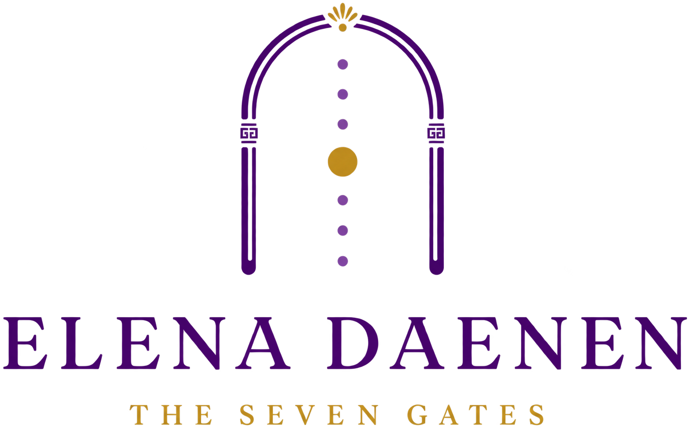
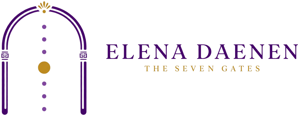
Your name in Roman capitals, and above it a doorway that carries the whole method inside it: seven points on a central line, a Greek key on the columns, and the light sitting on the keystone, the stone at the very top of an arch. Nothing in it is decoration. Every part of it is saying something you actually teach.
What each part means
Two lines, not one, and there is a reason. A single line is a shape. Two lines give the arch thickness, so it reads as a doorway you could physically walk through. That is the difference between a drawing of an arch and a gate with a threshold. Your method asks a woman to cross seven of them, so the mark has to look like something that can be crossed, not like a rainbow.
The seven gates, on the central line of the body. This is the method drawn rather than described. The fourth is gold and larger because it is the heart, the middle of the journey, and the turn between the ground and the flame.
The square spiral running along the columns, and the oldest pattern in Greek art. You looked it up yourself and you found the right meaning: the unbroken line, the flow that has no end, unity. It is one continuous line that never stops and never crosses itself, which is why it appeared on temples and on funeral pottery alike. It says Greece without a column, a laurel wreath or a vase.
The reason you went to Greece in the first place. You were told Elena is read as torch, or shining light. It sits at the top of the gate, above the seven, and it is where the promise lives: she already carries what she is looking for.
A logo is a mark of recognition, not an explanation
Your friend said the seven chakras are not obvious in the mark, and that the Greek goddesses are not obvious either. Both true. Nobody who has never met you will look at it and think seven energy centres and seven Greek goddesses. That is worth knowing, and it is not a fault.
Then you asked the real question: should my logo be the exact translation of what I offer, the first time a woman sees it on Instagram? The honest answer is no, and no logo does that job. A swoosh does not say running shoes. An apple does not say computer. What makes a woman understand what you offer in six seconds on Instagram is not the mark. It is the name field, the bio, the first line of your pinned post and the photograph of your face. Those four are what carry the meaning, and all four are written in this document.
Be recognised again. Survive at 40 pixels, in one colour, on a flyer, on a phone. Look like it belongs to a serious person. Still look right in five years. Yours does all four.
Explain a method. Say what you sell. Replace a bio. A mark that tried to show seven chakras and seven goddesses at once would become an illustration, and an illustration cannot be printed small, stamped on a photo, or carried for ten years.
So the direction you guessed is the right one: your clients understand the mark more as they experience your work, not less. That is what you want, because it means the mark rewards the women who stay instead of performing for the ones scrolling past. And the fact that your friends asked why the heart is bigger is the proof that it works. They asked. In a market where no mark provokes any question at all, yours provoked one, and you already have the answer ready: it is the heart, it is the fourth of the seven, and being the fourth makes it the middle, where the journey turns from the ground to the flame.
Why your name is bigger than the method, for now
Your friends asked whether you sell Elena Daenen or The Seven Gates, and you suggested making the method bigger with your name smaller underneath. It is a reasonable instinct, and the recommendation is to keep the lockup as it is. Four reasons, and one condition that reverses all of them.
- Nobody buys a method from a stranger. A method is a promise about what happens in a room. Until you have testimonials, the only evidence a woman has is the person holding that room. Right now, you are the evidence.
- The Seven Gates cannot be owned. Elena Daenen can. Three common English words cannot be registered as a category, and someone else will use them. Your surname is yours by law and by fact, which is exactly why it goes in front: it is the only part nobody can copy.
- It is what you actually sell. Your difference is that you hold the space and refuse to promise the healing. That is a statement about a person, not about a system. Hide the person and you delete the difference.
- Nothing is lost. The method is on the second line of the lockup, in the bio, in every product name and in the sentence you say out loud. You are not choosing between them, only which one arrives first.
The two versions, and when each is used
Site, flyers, print, presentation covers, the top of a page, anywhere it can be seen properly.
Favicon, app icon, a stamp on a photograph, the bottom of a story. The same gate with the fine detail removed, so it stays a doorway instead of turning into a blur.
Colour versions
The full mark reversed inside a purple circle. At the size Instagram actually shows it, swap to the small mark.
Rules
| Rule | The number | Why |
|---|---|---|
| Clear space | The width of one column on every side | The mark has fine detail. Crowded, the Greek key merges with whatever is next to it. |
| Minimum size, full mark | 40 px on screen, 14 mm in print | Below that the seven points and the Greek key stop being readable. |
| Minimum size, small mark | 16 px | It is drawn to survive a favicon and it does. |
| Minimum size, full lockup | 120 px wide | Under that, mark only. Never squeeze the words until the spacing between the letters collapses. |
| On photographs | Reversed, on a calm area, small mark preferred | Never over a face, never over a busy background, never with a shadow added to make it readable. Move it instead. |
| The gold | Only the heart point and the light at the top | Gold appears exactly twice in the mark. Adding a third gold element breaks the meaning as well as the balance. |
- Let it sit small and centred. The mark is detailed, so it needs air rather than size.
- Use the mark alone once people know you, and keep the lockup for anything a stranger sees first.
- Use the small mark whenever you are unsure. It never fails.
- Keep the seven points purple and the heart gold. That is the method, drawn.
- Stretch, tilt or rotate it. A leaning gate is a broken gate.
- Add a gradient, a glow, a shadow, or a circle of light behind it.
- Fill the arch, or close the bottom. The gate is open, that is the point.
- Change the number of points. Six or eight is a different method.
- Re-type the wordmark, or redraw the mark by hand. Use the files.
- Put the mark inside a square badge with rounded corners. Circle only.
The files · which one do I use, and when
You asked how and where to use lockup-stacked.png, so this table is written the way you will actually need it: find what you are making on the left, and the file to drag in is on the right. Every version was made from your own artwork, not redrawn, so the shapes are identical in all of them.
| What you are making | Drag in this file | Why that one |
|---|---|---|
| A class or workshop flyer | lockup-stacked.png | Your default, and the answer to your question. Mark above, name below, transparent background so it sits on linen or on a photo. Put it at the top, centred, about a quarter of the width of the page. |
| The cover of a deck, a PDF or a worksheet | lockup-stacked.png | Same file, same reason. Anything a stranger sees first uses the full lockup, because a stranger needs the name. |
| The same, on a purple or dark photo background | lockup-stacked-reversed.png | The light version, in linen and soft gold. Never put the purple lockup on a dark background and never add a shadow to make it readable. Swap the file instead. |
| The header of your website | lockup-horizontal.png | A website header is wide and short. The stacked version would push your content down the page. |
| Your email signature | lockup-horizontal.png | Same reason, and set it to about 180 pixels wide so it does not dominate the message. |
| The footer of a flyer that already has your name at the top | mark-full.png | The gate alone. Once your name is already on the page, repeating it is noise. |
| A stamp in the corner of a photograph | mark-full-reversed.png | Light version, placed on a calm area of the image, never over a face and never over a busy background. If it is not readable, move it, do not enlarge it. |
| Anything printed in black and white | mark-full-ink.png | One colour, no gold, no purple. For a photocopied studio programme or a rubber stamp. |
| Your Instagram, WhatsApp or YouTube picture | avatar-circle.png | The reversed mark inside a purple circle, 800 pixels. Use it only once people know you. For the first month your profile picture is your face. |
| Anything smaller than a thumbnail | mark-small.svg | Highlight covers, a watermark on a story, a tiny corner mark. The full mark turns to mud at that size. |
| The little icon in the browser tab | favicon.svg | Give this one to whoever builds the site. You will never open it yourself. |